
Overview
Pathful is an AI-powered career coaching platform designed to help
early-career professionals navigate career uncertainty. Through
personalized roadmaps, explainable AI recommendations, and
reflective check-ins, Pathful transforms overwhelming career
decisions into clear, actionable steps.
Bridging the Gap Between
Ambition and Career Reality…
An AI coaching experience that builds trust
through transparency. Every recommendation
comes with an explanation, every roadmap
adapts to user progress, and weekly check-ins
create accountability without pressure.
Proposed Solution
Early career professionals face career paralysis overwhelmed by conflicting advice, unsure which skills to develop, and lacking personalized guidance. Existing tools offer generic advice without context, leaving users more confused than when they started.
The Problem
"How can we design explainable career AI patterns that people actually trust with their livelihoods?"

Premise
🎙️Core Question
Users often don't know what to do next, which skills to prioritize, or
whether the advice they receive is reliable. The opportunity is to design
an AI-powered career coach that provides personalized, transparent,
and trustworthy guidance throughout a person's early career.
🤺Challenge
"A personalized AI career coach that transforms career
uncertainty into clear, achievable action through transparent
recommendations, structured planning, and ongoing accountability."

Improved Visibility and accessibility particularly for older users,
addresses a rapidly growing demographic with significant
financial assets. By making the app easier to read, navigate,
and trust, the redesign lowers support costs, reduces user errors,
and expands the app’s usable market. Together, these goals create
a more inclusive product that drives sustained growth, improves
brand trust, and delivers measurable returns on investment.
🎯Objective
These goals were selected because they directly impact user
adoption, retention, and long-term value. Personalization allows
the app to adapt to individual user behaviors and preferences,
increasing satisfaction and daily engagement while reducing
friction in routine banking tasks. This leads to higher feature usage
and stronger customer loyalty.
Visibility &
Personalization.
📱Existing Platform
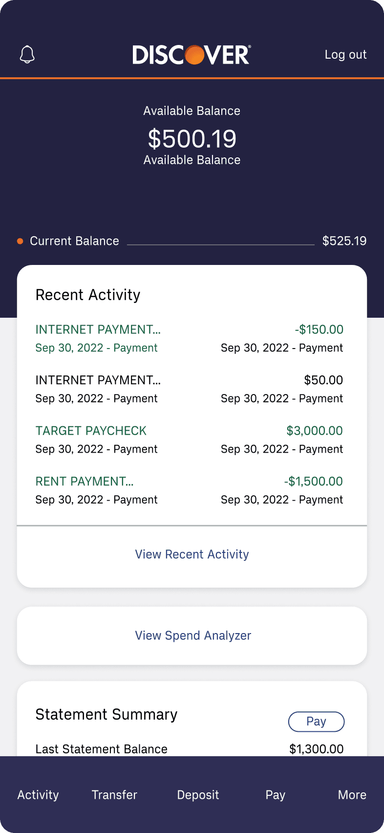
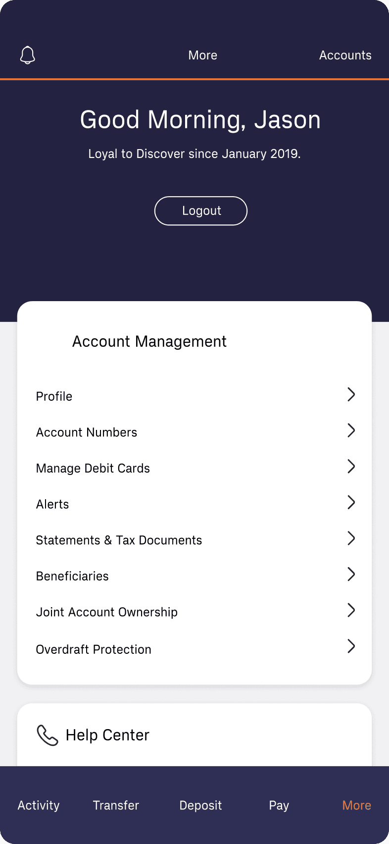
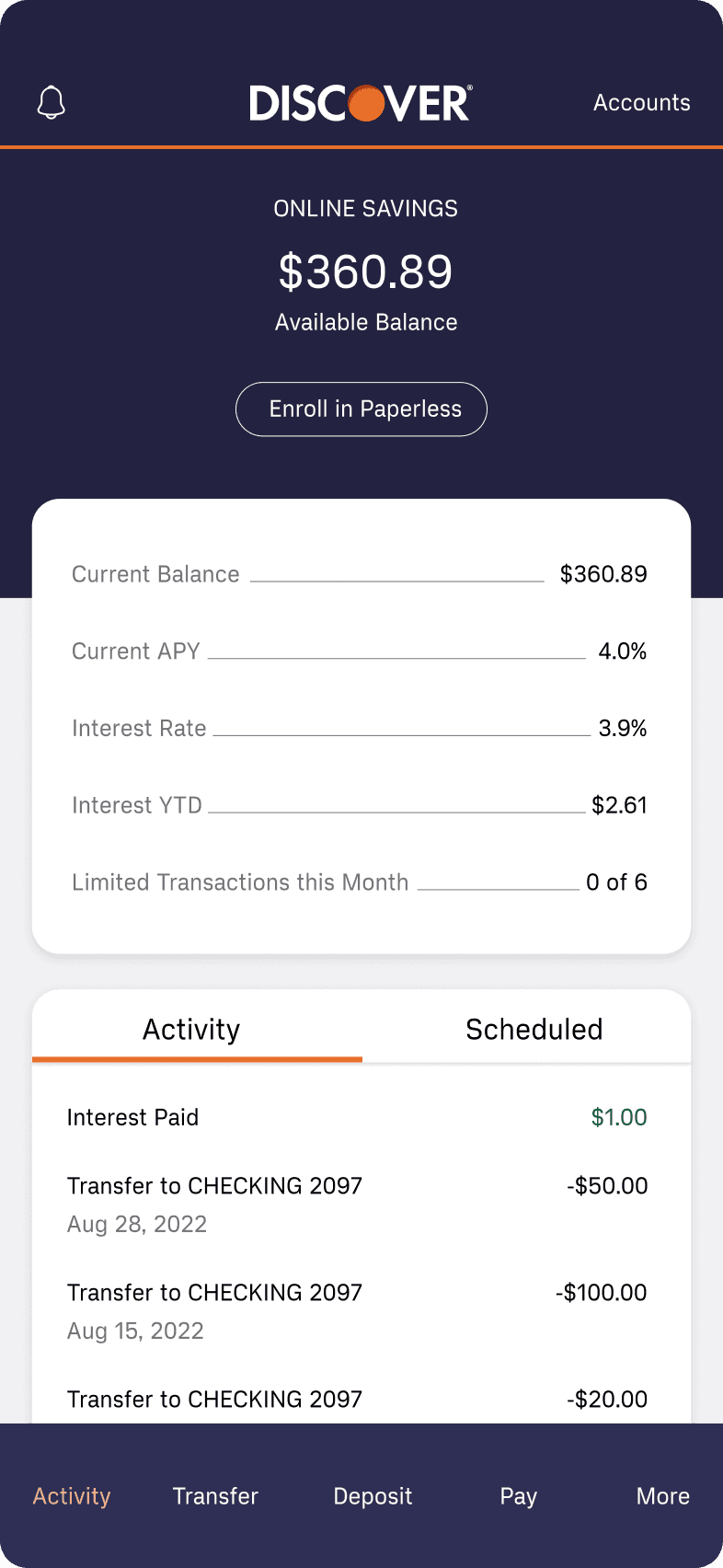
Our design audit began with a comprehensive evaluation of the
mobile banking app to build a clear understanding of the product,
its users, and the business goals behind it. This process included
stakeholder interviews, competitive benchmarking within the fintech
landscape, usability testing of the existing app, and a thorough review
of current features and user flows. Together, these efforts provided
valuable insight into how the app was performing and where it was
falling short.
Through this audit, we identified several UI and UX challenges that
were negatively impacting user trust, engagement, and task completion.
An outdated visual design, inconsistent interface patterns, and unclear
navigation created friction across key banking flows. We also uncovered
gaps in the overall user experience, with certain features underutilized,
incomplete, or lacking clear guidance—resulting in missed opportunities
to better support users’ financial needs.
Survey of the
Current Design!


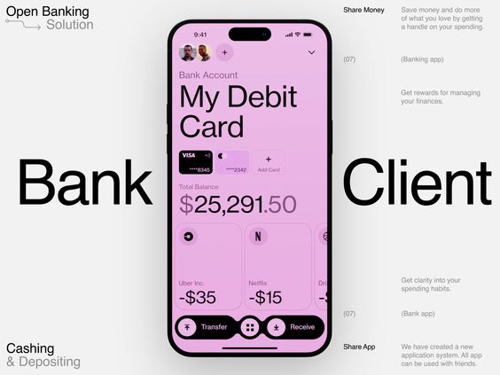
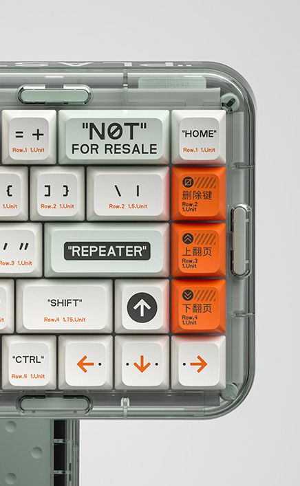
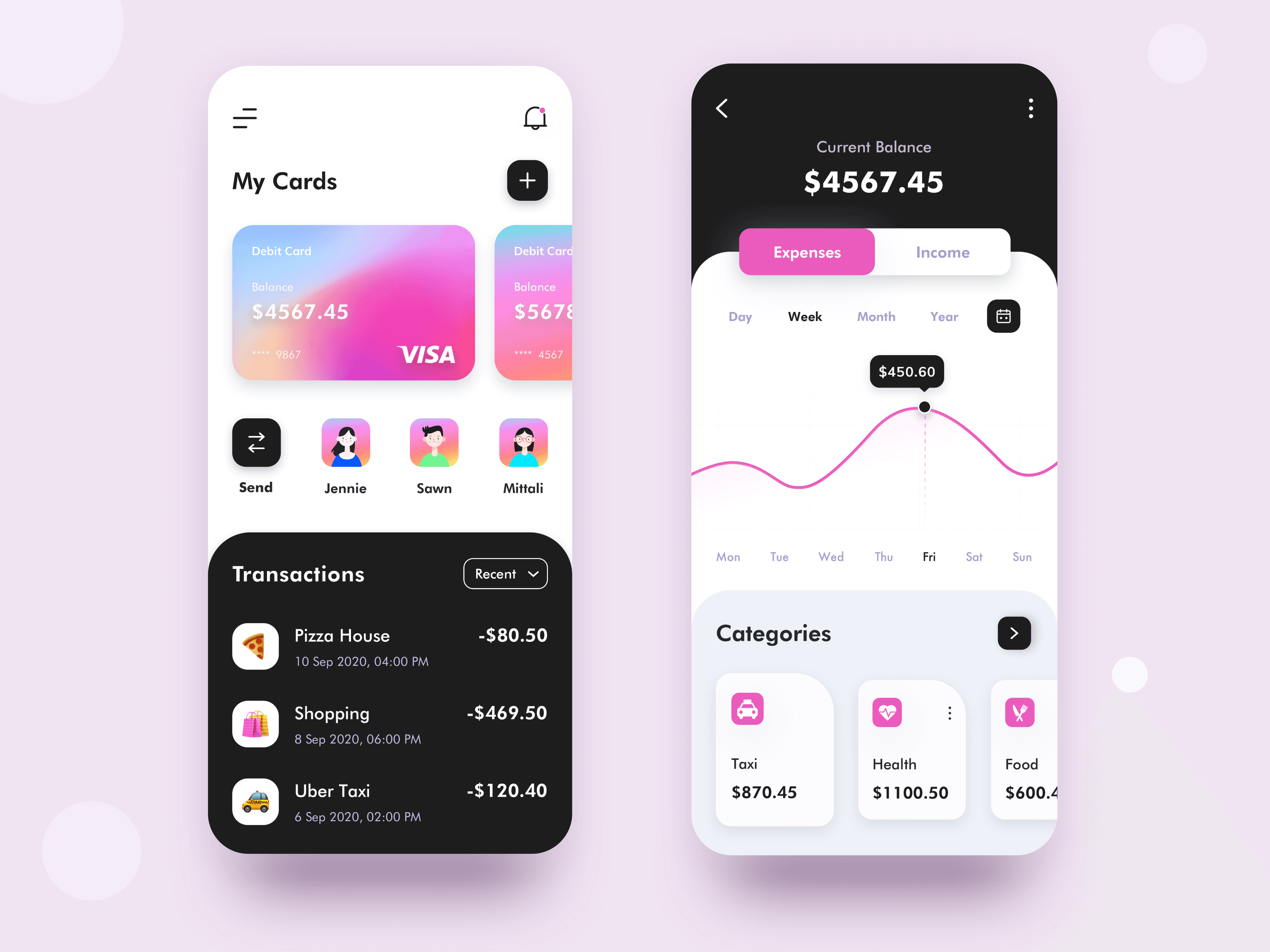



The selected visuals emphasize clarity and trust, using clean layouts,
generous white space, and structured grids to reflect transparency and
control. A calm color palette of soft blues, and neutral tones communicates
reliability and stability, while subtle orange accent colors introduce
warmth and guide attention to key actions.
🖼️Visual Inspiration
The mood board defines the visual and emotional direction for the
redesigned mobile banking app. The goal is to create an experience
that feels secure, modern, and approachable, helping users feel confident
managing their finances while reducing stress and cognitive load.
Mood board.
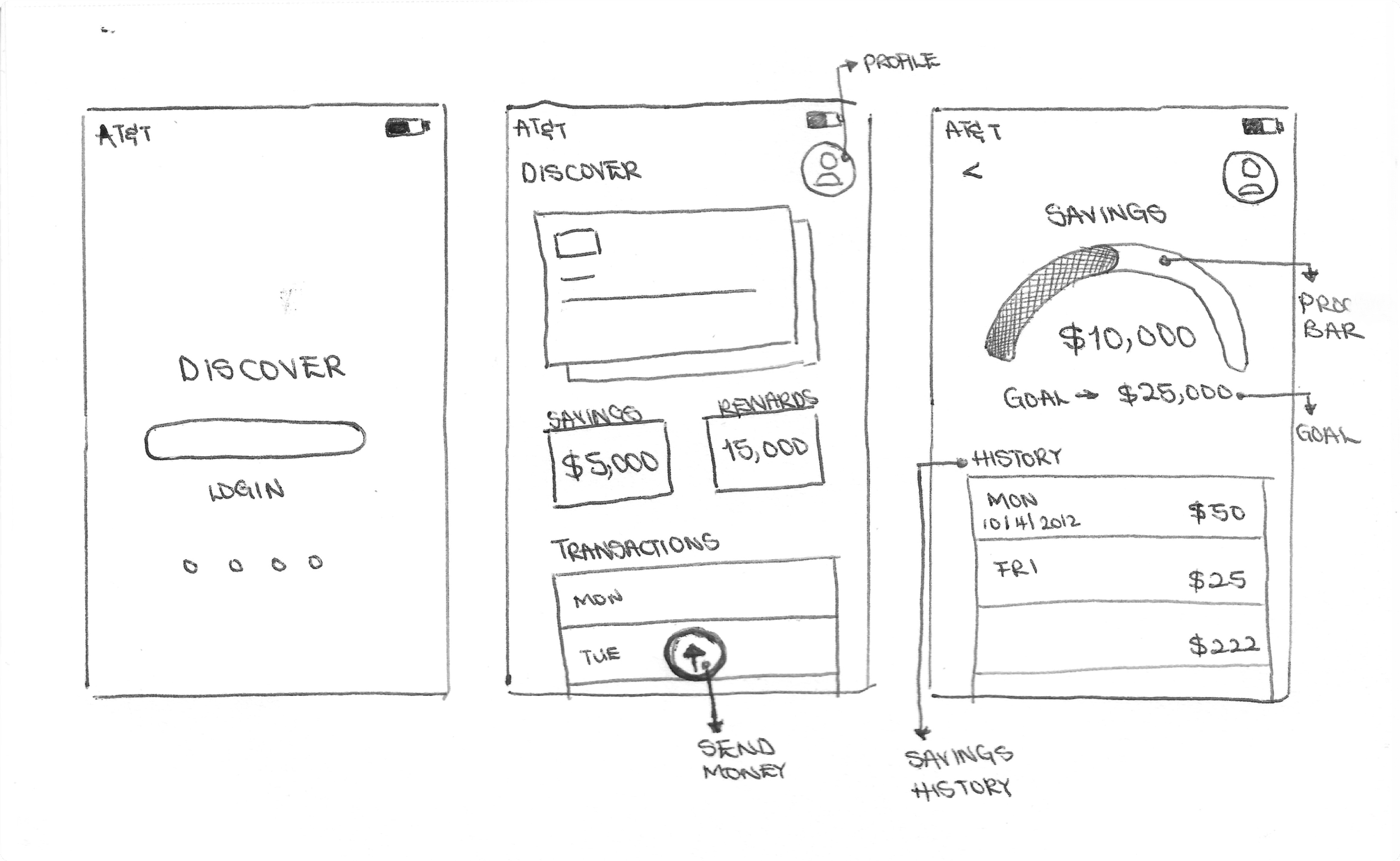
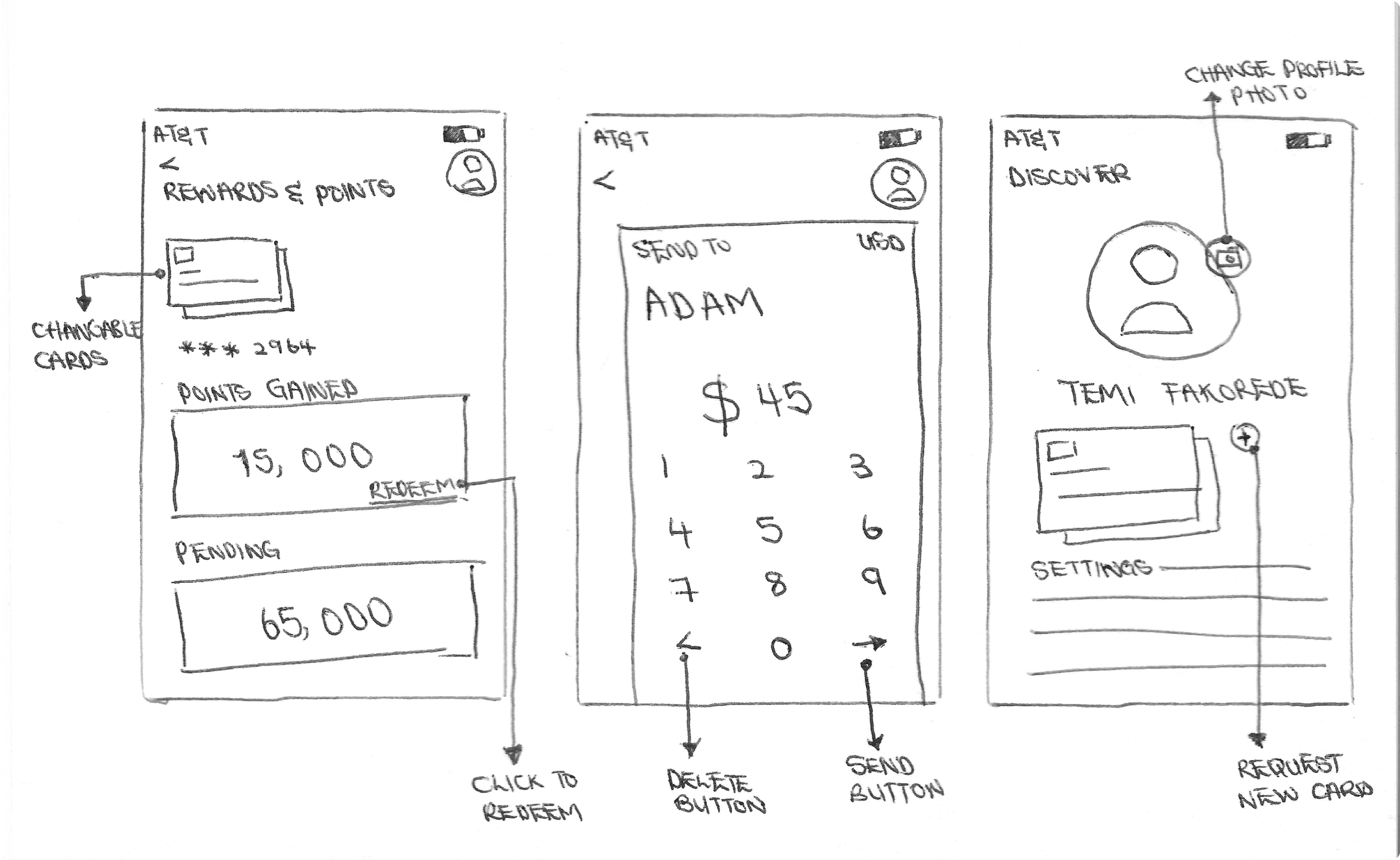
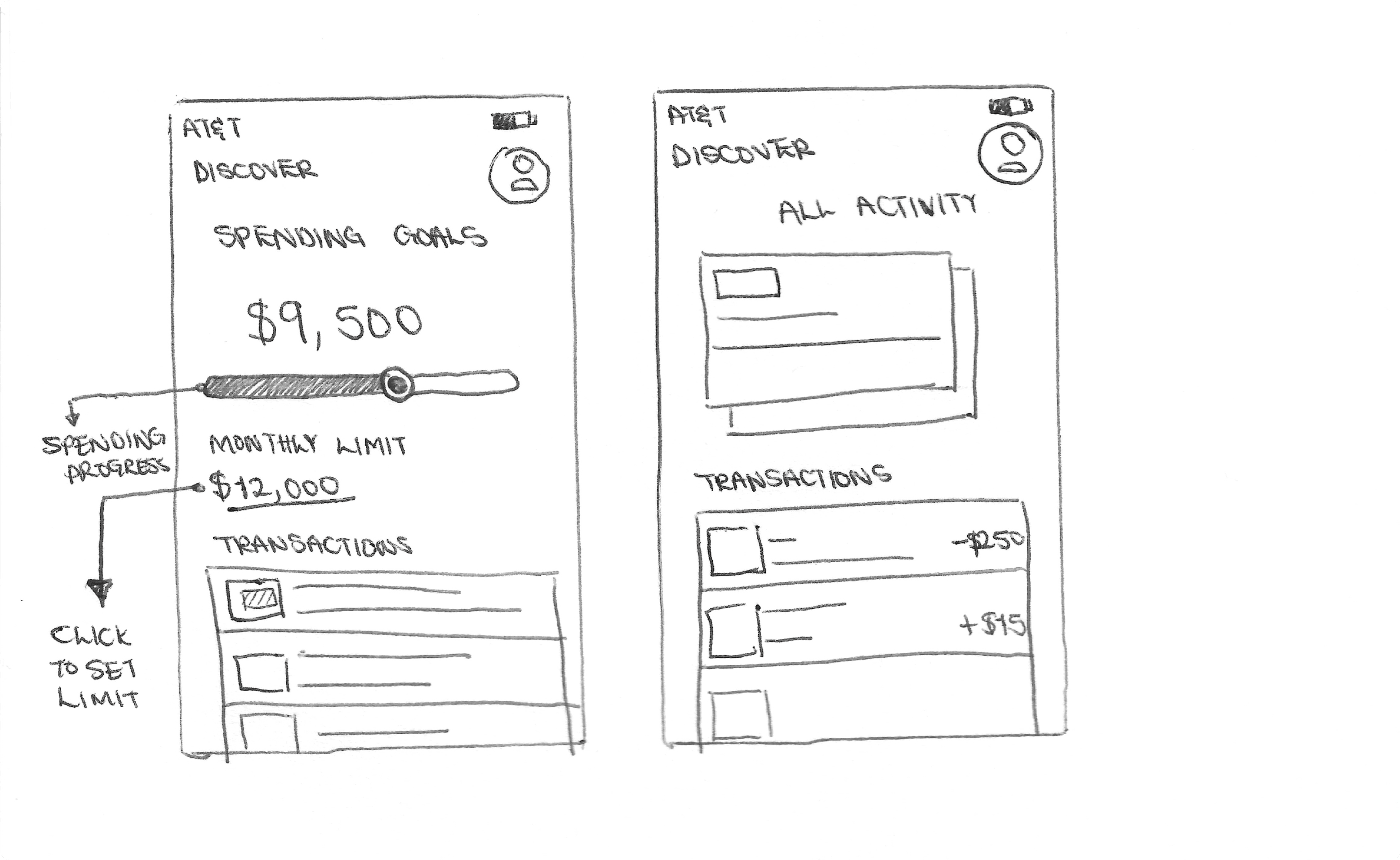
Sketching was used as an early exploration tool to quickly generate
and iterate on layout ideas without focusing on visual details. By
working with low-fidelity sketches, I was able to experiment with
different navigation patterns, screen hierarchies, and content
groupings for the mobile banking app.
This process helped identify the most intuitive flows for key tasks
such as checking balances, transferring money, and viewing
transactions, allowing usability decisions to be made early before
moving into wireframes and high-fidelity designs.
Sketches
💡Ideation
👨🏿💻Iteration
Wireframes.
Low-fidelity wireframes were created as a focused exploration of
information hierarchy, streamlined user flows, and intuitive interactions
within the mobile banking experience.
By removing visual design elements, this stage emphasized structure
and functionality, making it easier to evaluate how users navigate core
tasks such as checking balances, transferring money, and paying bills.
These wireframes enabled early validation of layout decisions, helped
surface usability issues quickly, and provided a clear foundation for
iteration before moving into higher-fidelity design.